Saturday, October 30, 2010

OCC Challenge - A Cozy Photo Inspiration

Well friends, another week as come and gone and here I am back again with my weekly sample for Our Creative CornerDiane Gilbert has been an awesome host this month and has really inspired me with some wonderful challenges!  For her final week as host, Diane has given us this cozy inspiration photo from everyone's favorite store - Pottery Barn.


I love the soft warm colors and those charming candles.  For my card, I chose to use the colors here and went a bit heavier on the green than in this shot.  I just received this Because I Care hostess set from SU and was itching to use it.  What a wonderful stamp - my hydranga stamped so crisp and clean.  I opted not to color it, but rather stamped the flourish from Baroque Motiffs over it and then clear embossed it.  With the emboss resist technique, I sponged Scattered Straw distress ink over the entire panel.  I also used a couple of random script stamps from the 7 Gypsies Avignon set.  I made a rosette out of Garden Green DP and also a little medallion for the sentiment using a Martha corner punch.  I added a little trim from Jo-Ann's to the bottom of the DP where it is punched with a Martha border punch and SU oval punch. 

Other than the fact that I think the rosette could have been about 1/3 smaller, I really like how the card came out.  Don't you hate it when you get a card finished and photographed and while you are blogging it, you see something you wish you had done differently...that's how I feel looking at the rosette - LOL. Oh welll, tomorrow's another day and probably another card :)

I hope you will stop by Our Creative Corner to see what my stampin' sistas over there are up to...always a beautiful batch of lovelies to look at on the OCC challenge blog. 

Thanks so much for stopping by.  Please leave any questions in the comments section and check back later for an update to the post to answer your question.

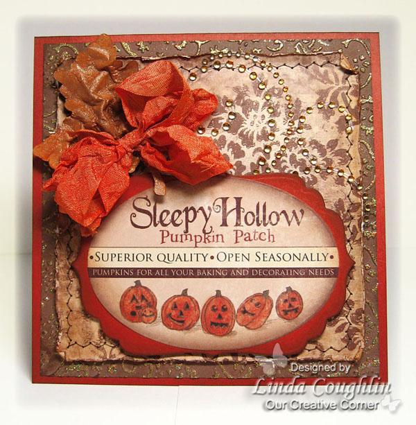
Have a great weekend and a Happy Halloween!!

Blessings & hugs,

Challenges Entered:
The Creative Cottage Challenge - Embossing
Simon Says,,,,Punch 'Em
4 Crafty Chicks - Roll With the Punches
Meljen's - It's a 2-fer
Drunken Stampers - Before Copics

Friday, October 29, 2010

Sweet 'n Wicked


Good morning and thanks for dropping by!  I'm here with a sweet treat to wish you a Happy Halloween.  Our challenge this fortnight at Fairy Fun Friday is Candy Wrapper.  You can make a candy wrapper or make something out of a candy wrapper.  You still have another week to play along.  I decided to make a candy wrapper so I dragged out this old candy dish and altered it.  I wanted a witch but Witch Gillian was a little to cute for me.  So our Prairie Fairy Queen whipped up this wicked witch to make me happy.  Isn't she cool?  Wish I would have had her at the beginning of the Halloween crafting season.  But now I'm all set for next year!.  


I printed her on Flourishes Classic White CS and colored her with my Copics and made a black rosette to pop her onto.  I covered the candy dish with Pumpkin Pie CS punched with a MS border punch and then wrapped some web-type ribbon around it.  Then I draped some spooky cloth over it (from the $ Store) and tied it on with my shabby seam binding.  

I finished it off with a Grungepaper flower and flourish colored with Peeled Paint, Dried Marigold and Dusty Concord distress inks.  Super cute, spooky and quick!  Gotta love it, right?  Hope you'll stop over to see what's up at Fairy Fun Friday.  Lots of great candy there too - eye candy, that is - LOL!

I'm attending a Halloween party tomorrow night?  Would this make a good hostess gift?  Do you think a non-crafty person would like it?

Have a great day!  Thanks so much for your comments and for stopping by.

Blessings & hugs,

Tuesday, October 26, 2010

No Buttons or Bows - Flourishes Timeless Tuesday Guest Designer

Several weeks ago I received an email from Betty Wright asking if I would like to be this week's guest host at Flourishes Timeless Tuesday.  Would I....humm, let me see...only in my wildest dreams - LOL!!!  Of course, my fingers were shaking on the keyboard when I typed my acceptance!

And now it is time for Flourishes Timeless Tuesday Challenge (FTTC90)!  It is the last Tuesday of the month when they have a guest challenge host.  This month's guest is YOURS TRULY!!!  I am challenging you to Anything Goes But Buttons and Bows.  There are so many wonderful embellishments to use for accents on our paper crafts, but all too often we fall back on our old favorites.  This week, let's stretch ourselves and see how creative we can be embellishing our cards.  We want to see what you can do without using buttons or bows.  Keep in mind that ribbon is still allowed along with lace and twine.  It's the bows and the buttons that are not.  We'd love to see what you create!

Flourishes has so many gorgeous stamps, but I am very partial to their fruit stamps.  I chose to work with the largest bunch of cherries from the Cherries and Peaches set.  In keeping with my autumn mindset, I kept the colors dark, rich earth tones.  And of course, I made it in my signature style - distressed vintage!  My main panel, layered over several pieces of K&Co. DP, is Flourishes Classic White cardstock, which I love for coloring with Copics.  The image was stamped in Memento ink and colored with  Copic markers. Then it was masked and a script stamp was overstamped in Old Paper DI.   I randomly embossed a mixture of UTEE/Heirloom Gold Perfect Pearls to give it just a hit of gold tone.  All of my main embellishments were cut with dies from Flourishes Classic Ivory cardstock, sponged with Antique Linen DI and then double embossed with clear UTEE.  I was going for sort of a country enamel look, which I think I achieved.  The flower was handmade and dyed with several colors of inks to try to match the cherries.  The jewely end caps were squashed into a Versamark pad and then gold embossed.   

Inside Panel With Space To Write
The inside panel has also been finished off leaving a blank panel to write a special message.  I stamped the cherries again in Antique Linen and the script very lightly with Old Paper. 
I hope you will stop by the Flourishes blog as well as the other designers personal blogs.  I'm so excited to be working with this elite group of designers this week! 

Thanks for stopping by to share my little bit of excitement this morning.  Have a great day!
Blessings & hugs,

Challenges Entered:
Sentimental Sundays - Distressing with a sentiment on the front
Alphabet Challenge - Z is for Zig Zags
Frosted Designs - Let's See Your Die Cuts

Monday, October 25, 2010

Simon Says Stamp and Show Something Spooky!

Good Monday morning and welcome back to all my blogging buddies!  I hope you all had a wonderful weekend.  Our Simon Says Stamp and Show challenge to you this week is to show us something SPOOKY.  We have some wonderfully spooky projects to show you and we can't wait to see what you show us.  We're looking forward to some spine chilling art work this week!!

As usual, I hemmed and hawed on what to make for the challenge.  I struggled to come up with something suitably spooky and really didn't have much in my stash that was appropriate.  Finally I decided to use some vintage images from The Graphic Fairy and make a luminaria. 


I printed the graphics for the four windows on vellum.  The Graphics Fairy actually has these four images set up as a PDF file on her blog so you can print them very large without losing resolution.  I created the frame out of plain white cardstock, however, after all was said and done, I wished I had glued the cardstock over Grungepaper because the cardstock is rather flimsy.  If I ever make Version 2.0, that's how I will do it.  I printed some spooky vintage images block style on the cardstock and then finished the surface using Tim Holtz's Rusted Enamel technique.  I used that technique for the first time last week and LOVED it.  This week, I used Old Paper distress ink, which I applied direct to paper and then embossed with clear EP.  Vintage Photo DI was then applied with a sponge over all the embossing.  It's sort of splotchy - light and dark - because I went over it pretty quickly with the Old Paper ink, but I like the effect it gives. 


The top edge was cut with the Tim Holtz Scrollwork On The Edge die. The project was embellished with Tim Holtz Grungeboard Mixed Minis painted with Adirondack Acrylic Paint Dabber in Pitch Black and coated with Ranger Crackle Accents.   Prima Say it With Crystals were also used for a bit of bling.  The black paper flowers were hand made using several dies including Tim Holtz Tattered Florals


Don't forget to stop on by the blogs of my teammies to see what they have been up to.  You'll find tons of fun and an immense load of talent on each and every blog listed here!  I am so proud to be in the company of these incredible artists!
♥Linda Elbourne, DT Coordinator - A Crafting Journey
♥ Dan - My Crafty Life
♥ Lynne Forsythe - The Next Best Thing
♥ Nancy Crissinger - What's Next???
♥ Nancy Wethington - Art From the Heart
♥ Terry Weitsma-Girbes - Terry's Cards & Creativity
♥ Katie Davis - Chantilly Rose
♥ Kim Costello - Paperbabe


I know it's a long post this week and a lot of photos, but I wanted you to be able to see all four sides and the corners of the luminaria.  I loosely followed the tutorial on SplitCoastStampers to make it, but changed the dimensions considerably.  The tutorial was a great starting point for me. 

Thanks for coming by and for hanging in to the end of the post.  I appreciate any comments or questions you care to leave.  Have a great week.

Blessings & hugs,

Saturday, October 23, 2010

Good Witch or Bad Witch?

Whew, what a week this has been.  I have been so slammed with overtime at work and really scrambling to try to make design deadlines.  The week has just flown by and I can't believe it's Saturday again!  So here I am back with you again to show you what I have made for Our Creative Corner.  This week, Diane Gilbert, our October hostess, has cooked up a color challenge for us that just smacks of Halloween.  She is asking us to use Pumpkin Pie, Certainly Celery, Rich Razzleberry and Early Expresso or our closest match.  Can you believe it?   I had all of those card stock colors. 


So those are the colors of card stock used here, plus I added some old Daisy D's designer paper.  I used this cute vintage witch image from The Graphics Fairy but I altered the colors in my PhotoShop Elements.  Here is the vintage image so you can see how she started out. 


I started out trying to make her skirt green to coordinate with Certainly Celery by changing the hue on the entire graphic.  So when the skirt changed color, so did her skin and hair - LOL!  I decided I liked her with green hair and skin which begged the question - with green hair and skin, is she a good witch or a bad witch?  You decide - I had fun with PhotoShop and got a much-needed giggle out of making this card. 

What else did I use? A couple of Spellbinders dies - Long Rectangles and Scalloped Rectangles plus Lattice Borderabilities, some orange glitter, a Tim Holtz ticket stamp, Stampin' Up! spider web embossing folder, Vintage Photo distress ink, hand dyed shabby seam binding and a couple of orange and green rhinestones from the $1 bin at Michael's. 

Hope you like my vintage witch card.  Thanks for any comment you care to leave.  Please stop by the Our Creative Corner blog to see what my team mates have made and maybe think about playing along this week.  Have a great weekend.

Blessings & hugs,
Linda


Challenges Entered:
Crazy4Challenges - Halloween
Drunken Stampers - Halloween
Speedy the Cat's Friends Challenge - Use a Punch or a Die Cut
Totally Gorjuss - Sparkle
The Crazy Challenge - Halloween
Oh La La Creations - Scary Stuff
Stamp With Fun - Halloween
Crafts & Me Challenges - Halloween
Creative Cottage Challenge - Halloween
Creative Imaginations - Spooky
C.R.A.F.T. Challenge - Spooky
Stampin' for the Weekend - Halloween/Fall

Monday, October 18, 2010

A Shabby Little Box

It's another Marvelous Monday at Simon Says Stamp and Show.  This week, we are challenging you to show us Anything But a Card.  Ever since I saw Kim Costello's star and booties, I have wanted to give Tim's Rusted Enamel technique a try. Using that technique, for this week's challenge I made a little box out of chipboard using Weathered Wood Distress Ink and clear embossing powder. After embossing, I sponged over all the chipboard with Vintage Photo DI. Other Tim Holtz products used include Addage Tickets, Wild Honey and Rusty Hinge DI to dye the flower, Vintage Photo Distress Embossing Power used on the hardware, Grunge Board Elements Plain, Flights of Fancy stamp set, Memo Pin.  I also dyed the crinkled seam binding to match using Weathered Wood and just a tiny touch of Vintage Photo distress inks.   
I was super short of time to complete this project because I had to have it submitted prior to leaving for a weekend trip this past Thursday.  I really wanted to make something sweet and shabby to be kept inside the box too, but just totally ran out of time.  So I guess that can be part 2 of this project for another day.  I have to tell you, though, if you haven't tried the Rusted Enamel technique, you should.  It is so easy and the results are stunning.  It was hard to capture it in the photos - craft projects always seem to look so much better IRL.

Now it's time to stop by the Simon Says Stamp and Show challenge blog.  There are some totally amazing projects to look at over there today and while you are at it, drop by the other design team members' blogs and leave them some love.  They are one seriously talented bunch!

♥Linda Elbourne, DT Coordinator - A Crafting Journey
♥ Dan - My Crafty Life
♥ Lynne Forsythe - The Next Best Thing
♥ Nancy Crissinger - What's Next???
♥ Nancy Wethington - Art From the Heart
♥ Terry Weitsma-Girbes - Terry's Cards & Creativity
♥ Katie Davis - Chantilly Rose
♥ Kim Costello - Paperbabe

Thank you so much for stopping by today and for your lovely encouraging comments.  I deeply appreciate all of my visitors!  Have a great week.

Blessings & hugs,

Saturday, October 16, 2010

Vintage Pumpkins

Happy weekend everyone!  So happy you stopped by to see what I have to offer for this week's Our Creative Corner challenge.  Our hostess, Diane Gilbert, has challenged us to pile on the embellishments this week and I went a little blingy.  With all the fall cards I have been making lately, I guess I got a little bored so I thought I would jazz things up with some bling.  The Close to Cocoa layer has been embossed with the CB Textile folder and then I embossed the high points with Judi-Kins Egyptian Gold EP.  I haven't had that stuff out in awhile and had forgotten how fun it is - lots of great sparkle!  I took an orange Copic and colored the white Prima Say it With Crystals resulting in wonderful topaz colored rhinestones.  I cut a leaf out of plain white CS with a Cuttlebug die and then dyed it with a combo of Rusty Hinge and Wild Honey distress inks, then sprayed it liberally with a mixture of Vintage Photo DI, Heirloom Gold Perfect Pearls and water.  It is really shimmery IRL.    The Sleepy Hallow main image is actually a Melissa Francis sticker - yeah, I went the quick route on this card due to a real lack of time.  I worked all weekend and then had to cram everything into three days as the DH and I left for a long weekend on Thursday morning. 

So that's it for this card.  I know I blew through this post pretty quickly so if you have any questions, just leave them in the comments and I'll get back to you on Monday when I return to my trusty computer (no laptop = no computer when traveling :(

Now hurry on over to Our Creative Corner to check out the wonderful makes of the rest of the team. 

Blessings & hugs,
Linda

Challenges Entered:
The Shabby Tea Room - The Pumpkin Patch
Flourishes Timeless Tuesday - Ink and Edge Distressing
Creative Belli Blog - Pumpkins & Fall Sketch
Pixie Cottage - Stitching and/or Sketch
Pixie Dust Studio - Fall into Fall
Stampin' B's - Fall Colors

Monday, October 11, 2010

I Was "Most Wanted"

About a month ago, my card won "Most Wanted" (first place) at Our Partner in Crafting Crime.  Because of that, I was invited to be a guest designer this week.  This week's theme is "Shine On You Dazzling Diamond" so basically all sparkle and shine is good to go for this challenge.  Here is the card that I made for this guest DT opportunity. 

I didn't set out to make a monochromatic card, but it just worked out that way with the More Mustard CS and the K& Co. DP.  Everything I picked up to go on the card just blended so nicely and supported the monochromatic style of this card.  This is a super simple card.  The die cuts are Spellbinders Labels Five and a Waltzing Mouse label stamp makes up the main image, while diamond embossed chipboard provides a medallion to hold the ribbon and flower element.  A bit of ribbon, a tiny handmade canvas flower and few sweet buttons finish off the card. 

A hugh thank you to all the ladies over at My Partner in Crafting Crime for picking my card as "Most Wanted".  So happy to be able to play along with your challenge this fortnight! 

Blessings & hugs,
Challenges Entered:
Tuesday Throwdown - Use chipboard
Stampin' B's - Make a Fall Card
Chrisma Cardz - Autumn Colors
Drunken Stampers - Monochromatic
Four Crafty Chicks - Distressing

Simon Says Stamp and Show Your Metal

Can Mondays be marvelous?  Yes, they can because every Monday Simon Says Stamp and Show has another marvelous vintage challenge for you to play in.  This week we want you to show us your metal.  And what a blast I had with this week's materials.  I've been looking at all the amazing metal work my teammies are putting forth and absolutely drooling.  I have always liked adding metal brads and other embellishments to my cards, but this was a step out into new territory.  Except I'm not at all experienced in working with metal and had no materials or tools so I had to improvise.  No Ten Seconds Studio Metal for me, at least this time around (Note to self:  Be sure to order some Ten Seconds Studio Metal!!!).   I scouted around the crafting-wasteland here in Miami but couldn't find any metal to buy and it really was too late to order when I finally got down to business so I scoured my home for some kind of embossable, workable metal.  Okay, here's where you will be ROFLing...I used an alumnium cake pan, the kind you use once and throw away.  But it didn't have the lovely color that the 10 Seconds Metals come with so once I die cut and embossed it, I painted it with Adirondack Acrylic Paint Dabber in Espresso.  I had to dab it several times to get it to cover completely and then once it was fairly dry, I sanded the paint off the high points. 

The frame was purchased for $1 at The Dollar Store (imagine that?) and painted it with Golden Crackle Paste.  First time I've used that stuff - a little pricey, but loads of fun and loving the result.  When dry, I spritzed it with a mixture of Vintage Photo Distress Ink, water and Heirloom Gold Perfect Pearls.  I created a photo mat with an embossing folder, cut an oval for the photo to show through, ink distressed it with Vintage Photo and spritzed it with the same reinker/Perfect Pearls mixture.  The flowers were hand made using So Saffron CS and canvas.  The canvas was dyed with Cameo Coral and a blend of Peeled Paint and Pine Needles DI for the leaves.  The LOVE letters were cut with the Cuttlebug Olivia alphabet from Groovy Guava CS glued on thin cardboard. 

That's about it for my "Show Some Metal" challenge from Simon Says Stamp and Show.  Here are the individual blogs of all the design team members.  I hope you will stop by and let them know how wonderful their art is. 
♥Linda Elbourne, DT Coordinator - A Crafting Journey
♥ Dan - My Crafty Life
♥ Lynne Forsythe - The Next Best Thing
♥ Nancy Crissinger - What's Next???
♥ Nancy Wethington - Art From the Heart
♥ Terry Weitsma-Girbes - Terry's Cards & Creativity
♥ Katie Davis - Chantilly Rose
♥ Kim Costello - Paperbabe


Friday, October 8, 2010

Thankful for Fishing!


It's another Fairy Fun Friday and I'm here to share my design team card with you.  Our challenge to you this fortnight is "Tag or Ticket".  You can make a card with a tag or ticket or simply make a tag.  You don't have to use a Prairie Fairy digital image, but we love it when you do!  We just hope you will play along with us in this fun challenge.

I got a bit carried away with layers on my card - eight in all and that's just on the outside.  I finished off the inside with another five layers.  This is such a heavy and rich-feeling card.  I decided to to a little fancy work with a Spellbinders border die, cutting four borders and piecing them together and assembling them on a square of Close to Cocoa CS.  That was followed by a double layer of CS and DP popped up on a layer of craft foam.  Then on top of that another double layer consisting of CS and CP, both upper panels stitched together.  I used the SU photo corner punch, which I dragged out of the bottom of my equipment drawer, and subjected the corners to the same UTEE/Perfect Pearls random embossing that I have used on my last two Prairie Fairy cards.  I guess I'm getting into a rut with that, but I really like how it looks and think it makes an excellent masculine style embellishment.  The image is a Prairie Fairy digi, printed on Flourishes white CS and colored with Copics.  I was experimenting with creating a sunset sky with the dots and blobs I've been using, but really didn't like it until I sponged with with Creamy Caramel ink to give it some distressing.  That filled in all the light areas, blurred and mellowed the sky and now I am quite happy with it - LOL.


I took the time to finish off the inside of the card with coordinating DPs, styles and embellishments.  I stamped the SU stamp Give Thanks on the tag, but if I decided not to use it for Thanksgiving, I can change out the tag and make it a birthday or some other occasion card.

So that's my card for Fairy Fun Friday this time around.  I hope I have inspired you to play along with the design team and will look forward to seeing your entry into our challenge!  I hope you will take time to visit the blogs of the other designers too. 

Products Used:
Stamps:  Gone Fishin' by the Prairie Fairy, SU Holiday Best (for sentiment) and leaf flourish is Inkadinkado
Paper:  SU CS - Naturals White, Close to Cocoa and Always Artichoke, Flourishes White CS for main panel and digital DP from Little Scrap Garden, Kallee paper pack
Ink:  Versamark, Copics, Vintage Photo and Creamy Caramel for distressing, Walnut Stain DI for stamping
Accessories:  Spellbinders Lattice Borderabilites, Labels One Nestabilities, SU Photo Corner Punch, SU brad, jewelry spacers, gold half pearls from Michaels

Thanks so much for stopping by today.  I do so appreciate your comments.
Blessings & hugs,


Challenges Entered:
Stamptacular Sunday - Layer It Up
Oh La La Creations - Nothing Floral
Dutch Dare Card Challenge - Tagalicious
All That Scraps - Manly Cards

Monday, October 4, 2010

Another Harvest Maid

Hello again and welcome back for my weekly Monday post for the Simon Says Stamp and Show challenge.  This week, the Simon Says Stamp and Show challenge is Numbers.  This was a challenge for me.  I just couldn't think of a project that I was satisfied with.  Nothing seemed worthy of the talent on this design team.  I just vascillated all week on what I should do and nothing really zinged me.  I finally settled on a tag with a numbers base.  I dragged out every single Tim Holtz Texture Fade I owned and ran them through with plain white cardstock.  Then I clipped out all the numbers portions and patchworked them together.  I sewed them with a zig-zag stitch and after being hit with several colors of distress ink, most heavily Vintage Photo, that became the basis for my tag. 

Continuing on with my recent harvest theme, I added a vintage September calendar with a scripture verse "Your labor is not in vain in the Lord".   I closely trimmed a vintage harvest girl with what looks like a sheaf of wheat on her back and a sickle on her arm.  I made three flowers which I dyed with Dried Marigold, Wild Honey and Rusty Hinge Distress Inks.  They were also spritzed with a mixture of water, Heirloom Gold Perfect Pearls and two drops of Vintage Photo reinker.  IRL, they have a gorgeous shimmer.  I cut a flourish with a die and attemped to create a string of gold pearls with gold Liquid Pearl.  They sort of smeared so I took my finger and rubbed them in, coating the entire flourish with gold Liquid Pearl.  I rationalized that with the thought that it looks more grungy that way.  I also dyed the seam binding with Rusty Hinge to match the flowers. 

For a quick and easy project this week, I was really happy with the way it turned out.  What do you think?  I'm not sure what to do with it, but it makes for a pretty piece of eye candy. 

Okay, enough about my project.  Hop on over to the other teammies blogs because their projects are 10xcooler than mine. 

♥Linda Elbourne, DT Coordinator - A Crafting Journey
♥ Dan - My Crafty Life
♥ Lynne Forsythe - The Next Best Thing
♥ Nancy Crissinger - What's Next???
♥ Nancy Wethington - Art From the Heart
♥ Terry Weitsma-Girbes - Terry's Cards & Creativity
♥ Katie Davis - Chantilly Rose
♥ Kim Costello - Paperbabe 

I can't wait to see your Numbers project over at Simon Says Stamp and Show this week.  Thanks for stopping by and for your generous comments.

Blessings & hugs,

Saturday, October 2, 2010

Beautiful Fall Colors

Oh, the colors of fall.  Can any other season truly compare?  Such a beautiful time of year and we are celebrating the season this week at Our Creative Corner. It's a new month and we have a new hostess, Diane Gilbert of My Little Stampin' Spot.  She has a beautiful fall color challenge for us.  Use the colors Old Olive, More Mustard, Cajun Craze and Early Expresso or the closest match you have.  For my card, I substituted Really Rust for Cajun Craze and Chocolate Chip for Early Expresso (note to self:  be sure to order the new SU colors!).  While I was noodling ideas for this week's card, I happened to stop by Isabella's Sketchbook and lo and behold, Isabella has some new fall digital images that are splendid!  That made me very happy because I seem to be bored with all my existing fall images.  You gotta love the instant gratification of purchaing digis too.  In all of about 2 minutes I was printing this delight and ready to color it up. 

The image was colored with Copics and UTEE with some Heirloom Gold Perfect Pearls mixed in was randomly embossed around the edge then Vintage Photo DI was sponged over it.  The border flourish and sentiment are from the Celebration of Thanks set by Verve.  The leaf is a Cuttlebug die that I had fun dying with Old Olive and Really Rust with a little Perfect Pearls/DI mixture spritzed on for glimmer.  I really love the way this one came out.  I think the image is gorgeous and I was so pleased with the way it colored up. 

So have you already stopped by Our Creative Corner to see what they other designers have for your beautiful fall colors inspiration?  If not, hope you will take time to stroll through their cards and enjoy the crisp fall feeling they provide. 

Products Used:
Stamps:  Apples & Pumpkins by Isabella's Sketchbook, Celebration of Thanks by Verve
Paper:  Really Rust, More Mustard, Old Olive, Chocolate Chip, DP is Auturm Thyme Again Add On Pack (currently a freebie) (andI changed the color slightly in PSE to make it more of a mustard color)
Ink:  Walnut Stain and Vintage Photo distress inks, Versamark
Accessories:  Vintage Wallpaper Embossing Folder from SU, Spellbinders Tag Die and Mega Rectangles, Cuttlebug Leaf Die, Old Olive Ribbon rom SU, Tim Holts mini safety pin, hemp rope, Ultra Thick Embossing Enammel, Heirloom Gold Perfect Pearls, Vintage Photo reinker

Thanks so much for stopping by and for all your wonderfully encouraging comments.  Wishing you a wonderful fall weekend!

Blessings & hugs,

Challenges Entered:
Sentimental Sundays - Let's See Some Dimension
Stamptacular Sunday - Seasons Change
Incy Wincy - I Wonder What it Could Be (anything goes)
Ditital Tuesday - Thank You/Give Thanks + a digi
Tuesday Taggers - Here Comes Autumn
For Fun Challenges -  Fall, No Halloween
Simon Says Stamp - It's Autumn
If the Shoe Fits - Orange
Stampin' for the Weekend - Autumn Inspiration
Flourishes Timeless Tuesday - Fall/Harvest theme using the colors of green, brown, orange/russet and cream
Speedy the Cat Friend's Challenge - Buttons & Bows

Friday, October 1, 2010

More Fairy Fun With Ric Rac

Last week, we began a bi-weekly challenge to use Ric Rac on your project over at Fairy Fun Friday.  The challenge still has another week to run, but we just wanted to provide a teaser to remind you that the challenge is still open.  I have been having fun with ric rac and was happy to have another excuse to use it.  I purchased a roll of this jumbo style, which I used last week on my sunflower card in its original color.  Since I had an entire roll of the light blue, I really didn't want to invest in more so I decided to try dying it.  I really like the way it turned out.  I used Tim Holtz Peeled Paint Distress Ink and dyed it by blotting the ink pad directly on my craft sheet and spritzing with plain water.  Wearing a rubber glove, I mixed it up with my fingers and smooshed the ric rac around in it until every bit of it had absorbed the green.  Then I spritzed it with a mixture of water, Heirloom Gold Perfect Pearls and two drops of Vintage Photo reinker.  You don't see it in the photo, but the ric rac has a bit of gold shimmer to it.  I stamped nautical equipment around the border of the base in Walnut Stain and then embossed the entire border with UTEE with a little gold Perfect Pearls mixed in.  I found some weathered wood digital DP in my digi stash and played with the color in PhotoShop Elements until it matched the ric rac (boy, do it get a kick out of doing that!).  You can't see much of it, but that is a piece of cardboard that I ripped the top layer off of so the ridges show, and of course it was sponged with Vintage Photo DI.  The gold corners are a piece of an element I created with a Martha Stewart corner punch and were embossed with gold EP.  The image was colored with Copics - I loved doing the sky and sea with mostly dots and blots.  

Let me know if you have any questions.  Be sure to stop over at the challenge blog to see the other designers' samples.  And we hope you will play along during this remaining week of the ric rac challenge.   Thanks so much for stopping by today and for your lovely comments.  They really do mean a lot to me.

Blessings & hugs,

:


Challenges Entered:
Sentimental Sundays - Let's See Some Dimension
The Crazy Challenge - No Ribbons or Buttons
Incy Wincy - I Wonder What it Could Be (anything goes)
Paper Playtime - Listen to the Rhythm of the Falling Rain (anything water related)
Stamp Something- Something to Celebrate
Blog Widget by LinkWithin


I changed my font at thecutestblogontheblock.com