Friday, January 30, 2009

Song of Spring

Whew, finally, I have finished this card. I have struggled with it for the last three evenings! Most of the time, my cards go together pretty easily, but once in awhile I seem to hit a wall. I wanted to do something bright and cheery for spring and pulled out SU's Serene Spring set, which I haven't used before. Then, as always, I set out looking for the right paper. That was my first snag. I don't seem to have any "bright and cheery" designer paper. I gravitate toward vintage/distressed styles and colors. So I settled on last year's SU DSP Afternoon Tea with its soft blues and greens. I thought it would be perfect. I also was working on this week's SCS challenge SC212 so I didn't have much flexibility in the layout. I ended up re-doing the front panel three times before I was satisfied. Actually, I don't even know if I am satisfied, but I finally said "enough already" and glued it together. Let me know what you think - could it be improved? If so, what would you have done differently? It was to the last version that I added the antique told micro beads. This is the first time I have used them and they were very easy to use. It finally gave it a moderate amount of zing, which is what was missing from the first two versions. I thought they were blah.

I learned to to make the clouds on Mothermark's blog. She has a terrific tutorial on the technique. I used Soft Sky to match the DSP. I think it adds a nice touch. Everything else is straight forward.

Here's the card recipe:
Stamps: SU Serene Spring and Organic Grace, the music notes are a stamp from Art Impression.
Paper: SU's Afternoon Tea, Soft Sky, Groovy Guava and Whisper White
Ink: Versamark, Chocolate Chip, Soft Sky, Creamy Carmel, Groovy Guava and Wild Wasabi
Accessories: Cuttlebug and Circle and Scalloped Circle Nesties, Flourish die from BossKutz, Martha Stewart Micro Beads, Martha Stewart leaf punch, Antique Gold dimensional paint, Egyptian Gold EP from Judi-Kins, craft foam for popping up image




Wednesday, January 28, 2009

Tilda Blog Candy Contest

Want to win some awesome blog candy? No, not from me. I'm not on a design team or a company rep so I'm not getting freebies to give away. But Irina over at Everything Paper Crafts is giving away two Tilda Valentine's stamps. You have until Feb. 1st to enter by answering two simple questions. Plus you get a second entry if you put a link on your blog so others can learn about the contest. So hop on over to Everything Paper Crafts. Irina is an amazing card artist and you are sure to love purusing her creations!

Tuesday, January 27, 2009

Act of Kindness


Here's the card that I made with the Ink, Spray, Dry technique described below. The image is from the retired Sweet Seasons set from SU and is stamped on 140# watercolor paper with Stewart Superior Black India Ink and Versamark and then clear embossed. It was watercolored with reinkers. The shells are from the SU Stipple Shells set, stamped in Close to Cocoa on the watercolor paper, cut out and then glazed with Crystal Effects. The charm is a Fresh Metal Charm from the jewelry aisle at Michael's. The fancy brads are simply a jewelry rondell with a plain black brad inserted through it. I don't remember the maker of the paper flowers as the container is long gone. The black gingham ribbon is SU and the flourishes are from the Priceless set, again stamped in the black india ink and versamark and then heat embossed with clear EP. That's all for today. Hope you like my card and tutorial.


Ink, Spray, Dry Technique

Here's a technique to create some cool background paper. I remember reading about something along that line awhile back, but couldn't put my hands on the directions so I worked it out on my own. (Note: I just checked SCS and it is similar to the Ink, Spray, Smash technique, but I think this gives a softer pattern). I was really happy with the way it came out. I have never done a tutorial before so please bear with me.

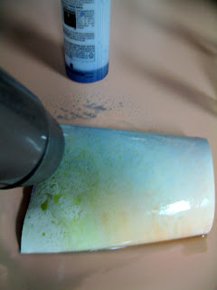
Supplies: Glossy photo paper, reinkers, water, spray bottles and a hair dryer
Be sure to work on a surface that will tolerate wetness and won't stain. Add an ounce or so of water to each spray bottle and then 3-4 drops of ink from your reinkers - one color per bottle. I wanted to make a background for a beach scene so I chose water and undersea colors - Bashful Blue, Old Olive and Really Rust.
Saturate your photo paper and spray different colored ink solutions randomly or in a pattern of your choice. I kept the blue towards the top and the undersea colors at the bottom. It was purely by accident, but the bottle I used for the Old Olive had contained Tattered Angels Glimmer Mist and I didn't rinse it out. There was glimmery stuff in the bottom and it really added to the pattern.
Once you have sprayed an adequate amount of ink on the paper, start to blow it dry with your hair dryer on high. Having the dryer on high moves the solutions around as they dry and helps create your pattern. I recommend having a light coat of color initially as you can continue to add more color and dry it in between coats, but if you start out dark you can't really lighten it up. For this result, I added color and dryed it three separate times. I got a couple of blotches of Old Olive on my last coat because my spray bottle was almost empty and it didn't spray evenly. I didn't mind as I thought it added to the effect.
Here's the finished product and I'll post a card that I made with it.

Saturday, January 24, 2009

Hearts & Flowers

I'm glad I finally had the opportunity to use this charming image of two angel children embracing. Sometimes when I make collage cards, I make several elements and then decide not to use all of them. I move them around the card to see what fits and sometimes I have extra elements that just don't work into the design. So I set them aside for a later work. That was the case with the angels. I made them in the fall when I was making a lot of Christmas cards and had them ready for a card but it just didn't work out. I decided to make one last Valentine's card and use them on that. The card doesn't have to be used as a Valentine. It could be used to express any kind of love or affection - mother's day, a sister's birthday or other occasion.
The main image of the angels was stamped with Versamark on vellum and embossed with gold EP and then layered over a small scrap of DP. All the rest of the DP on this card is from SU's LeJardin (retired) designer paper.
Card Recipe:
Stamps: Angelic, Heartfelt, Filigree
Paper: Very Vanilla, Close to Cocoa, Bashful Blue, LeJardin DSP
Ink: Versamark, Creamy Caramel
Accessories: Detail Gold EP and Judi-Kins Egyptian Gold EP, Antique Linen Distress Stickles, Creative Memories Heart Maker and heart cutting template, gold "pearls" from Michaels, gold thread, sewing machine, Martha Stewart heart punch, SU ribbon (retired)

Thursday, January 22, 2009

Love of a Lifetime

Burrr...it's sunny here in Miami but still COLD!! At 10:00 a.m. it's 49 degrees. We had frost on our cars in the driveway this morning!! I'm thinking of my homeless clients who come into the food pantry that I am running for my church. We only saw one last night so hopefully they made it to shelters!

I came home from work last night and finished up this vintage Valentine collage. I think it came out so cool. It all started with the picture of the couple embracing. I thought it would be a nice guy type Valentine, especially for someone's sweetie who has been/is in the Air Force. I made the retro postcard from a scrap of Very Vanilla, deckle cut the edges, added a cupid postage stamp from a digital collage sheet and then stamped the "handwritten" sentiments from the Feeling Groovy set from Verve Visual. The 'Be Mine' heart was from the collage sheet also.
The BG panel is Always Artichoke stamped and clear embossed with a number of different travel stamps to give a world traveler flavor - fort of like a GI traveling with the service. I don't know why I chose to make the heart black. Maybe to make it more mascualine, but the black really appeals to my eye. I thought the Philosophy Tag from Tim Holtz really pulled the whole Love of a Lifetime theme together.
As always, I have finished off the inside panels with coordinating paper, stamps and stitching. If you double click on the photos, they will open and you can see the details close up.

Here's the card recipe:
Stamps: Always and travel stamps from SU including Travel Post, Up in the Air and Balmy Breezes. The map is from ToyBox.
Paper: SU cardstock Basic Black, French Vanilla and Always Artichoke
Ink: Basic Black, Versamark, Close to Cocoa and Creamy Caramel
Accessories: HodgePodge Hardware, Clear EP, Tim Holtz Philosophy Tags and Swivel Clasps, collage sheet from Digitalcollagesheets.com, CM flower punch, notion flower from Jo-Ann, sewing machine.

That's it for today. Hope you all are staying warm. Let me know what you think of my card!


Sunday, January 18, 2009

Still The One

This week's challenge over at OCC is to make a card using the technique emboss resist. I had pulled the Summer by the Sea set out intending to make a Valentine and was debating how to color the image of the couple, wondering if I should paper piece their clothes. So I did some surfing for inspiration and thought the emboss resist technique would solve those problems for me. I also hoped on over to Splitcoast Stampers to check this week's card sketch challenge. I liked the sketch and decided to go for a double challenge. Initially I was going to make a girly romantic sort of Valentine with this stamp, but after shuffling through my substantial hord of paper, I concluded that I just didn't have the right paper (humm...another on-line shopping spree coming up?) when the Western Sky DSP caught my eye and the ideas started percolating. Yes, yes, a guy Valentine! Perfect, knowing how hard it is for me to come up with ideas, stamps and paper to create any type of card for a guy.

I had purchased the Verve Visual Feeling Groovy set about six months ago and it has some great sentiments for this kind of occasion. I really loved last year's SU In Colors, especially these two - Blue Bayou and River Rock and enjoyed having the opportunity to work with them again.

Card Recipe

Stamps: Bronc Busters and Summer by the Sea and Canvas BG stamp from Stampin' Up! and Feeing Groovy from Verve Visual
Paper: River Rock, Blue Bayou, Western Sky, Whisper White
Ink: Versamark, Blue Bayou, River Rock, Soft Sky
Accessories: White EP, Clear EP, Cuttlebug, Concentric Stars die, Nestabilities Curved Rectangles, brad from Hodgepodge Hardware, Tm Holtz Fragment and Trinket Pin, hemp thread and sewing machine

Hope you like my card!

Friday, January 16, 2009

Shabby Envelope

I have been so busy this week with work and my volunteer work that I haven't had time to make a card. But I wanted to give you something to look at so I am posting a card that I made about four months ago. It is actually the second collage card I ever made and it is still one of my favorites. The entire card is mounted on a shell of Whisper White, the next layer up being Close to Cocoa and the top layer of the base is Creamy Caramel. The edges of the layers are distressed and sponged. I created the envelope out of a piece of Creative Memories paper and stitched it.


Card Recipe:
Stamps: Days Gone By, Gentler Times,Verve Visual
Paper: Creamy Caramel, Close to Cocoa and Chocolate Chip for the base, envelope is constructed from Creative Memories paper
Ink: Creamy Caramel, Versamark for embossing
Accessories: Gold EP, SU ribbon, a piece of gold net ribbon from my stash, SU button, the small flowers were embossed with a Cuttlebug folder and punched out with a Creative Memories punch and the brads are SU, Cuttlebug and Vintage die, machine stitching, random silk flower

Thank you for visiting my blog. I'd love to hear what you think of my card so I hope you will leave me a comment. Have a great weekend and stay warm!

Sunday, January 11, 2009

A Rose for You

Here's the product of my weekend stamping time. This is another one of my multi-layer, multi-panel cards. I love the colors and print in this Stampin' Up! Bella Rose DSP. Continuing with my Valentine's Day theme, I thought the Bella Rose DSP was quite romantic. This card could be used as a Valentine or simply to convey love and affection since it doesn't say Valentine anywhere on the card.

The card is built on a shell of Whisper White plus base layers of Riding Hood Red and Kiwi Kiss. The Kiwi Kiss cardstock was clear embossed with the same rose stamp I used for the main image to give the base layers a bit of texture. For the main image, I stamped it, then masked it and sponged with Creamy Caramel and Chocolate Chip for a bit of depth (since I don't have an airbrush system). The charm is a Fragment by Tim Holtz. I stamped the rose again in Riding Hood Red, stamped off first and then stamped again for a lighter image. Then I stamped the 'Love" stamp from Verve Visuals Mixed Messages, punched it with a Creative Memories circle punch and affixed it to the back of the Fragment with Crystal Effects. The paper flower was made with Riding Hood Red card stock and several different sized flower punches. I dampened the paper after punching to shape it the way I wanted it to look. After I threaded the ribbon through the punched holes and had already glued it down, I decided I would have liked it better had I threaded it in a criss-cross pattern.

Both panels on the inside of the card were also finished off with multiple layers and machine stitching.


Card Recipe:
Stamps: SU Heaven Scent & Corners Mini, Verve Visual Mixed Messages, All Night Media/Anna Griffin

Paper: All SU - Kiwi Kiss plain and textured, Riding Hood Red, Bella Rose, Whisper White

Ink: Riding Hood Red, Kiwi Kiss, Creamy Caramel, Chocolate Chip, Versamark

Accessories: Riding Hood Red taffeta ribbon, Scallop Punch, Crop-a-Dile, QuicKutz Flourish die, Square Nestabilities, craft pearls, Silver EP, Tim Holtz Fragments and heart wing brad from Creative Imaginations.

Monday, January 5, 2009

Love Dreams

I am definitely loving making Valentine's Day cards. Such dreamy romance! This time I went for the Victorian style. As I continue to experiment with collage cards, I have been drawn to those made with printed collage pieces such as the ones on this card. I discovered a wonderful digital source for these images called Digital Collage Sheets. A couple of great aspects about this vendor are that once you pay on line, you receive an email with the PDF file attached - no waiting and no shipping & handling! The images are clean and clear. You can print them out on your home printer set for the highest print quality and they come out great!

This card was so much fun to make but it took me many hours. I have been working on it off and on for four days. All of the edges were distressed with scissors and sponged with Creamy Caramel. Both inside panels were finished with multiple layering and stitching plus the back panel was stamped. The envelope was hand-made and is also very embellished.
Now for the card recipe. After four days and all the different products I used on this card, I hope I can remember them all.
Card Recipe:
Collage image: digitalcollagesheets.com
Stamps: Inside sentiments from Rubbernecker and SU Heaven Scent, bottom panel All Night Media/Anna Griffin, back panel stamps are SU Gentler Times and See It With the Heart
Ink: Versamark, Bravo Burgundy for embossing and the inside pink ink is actually the lavendar petal from the ColorBox Petal Point fluid Chalk
Paper: SU Pink Pirouette, Very Vanilla, SU DSP Parisian Summer, and the pink dotted paper is by Melissa Frances
Tools: Cuttlebug and CB Hearts & Stamp
s die, Quickutz Flourish die, Spellbinders Mega Nestabilities Curved Rectangles die, Dazzling Diamonds glitter, heart charm from Jewelry Essentials, button is from LaMode Vintage collection, pearl from SU Pretties Kit, velvet ribbon, silk flowers and notion flowers from Jo-Ann's, Martha Stewart border punch.
Hope you like my latest creation. I think it will make someone a treasured Valentine's gift.

Thursday, January 1, 2009

Now on to Valentine's Day

The "holidays" are over and it's on to Valentine's Day, the next big greeting card day. Of course, we cardmakers can always find reasons to make and send cards. We don't need no stinkin' holiday, LOL! But I am rather fond of making Valentine's cards so I took the plunge and made my first one for this year.

I just love Stampin' Up's Riding Hood Red from this year's In Color Collection. I think it goes beautifully with Close to Cocoa and then decided to add Always Artichoke as a third color.

I saw this neat card layout on this blog and thought the heart from the Always set would work perfectly for it. The panel for the main image is actually layered on the inside panel and a square window is cut in the front panel. This took a lot of precise measuring and cutting. I stamped the heart first with Versamark and then immediately with Riding Hood Red classic ink. I stamped the image on Whisper White and clear embossed it. The filigree corners were cut with the CB Vintage Die and silver embossed. Then I pounded and knicked them up a bit and dabbed a bit of Basic Black ink on them to give them a vintage look to match the charm.


Card Recipe (Everything is by SU):

Stamps: Always, Together Forever

Paper: Bella Rose DSP, Close to Cocoa DSP (retired), Always Artichoke, Riding Hood Red, Whisper White

Ink: Riding Hood Red, Versamark, Always Artichoke

Accessories: Cuttlebug, Square Nestabilities, CB Vintage die, SU ribbon, Blue Moon heart charm, silver and clear EP and sewing machine.

New Year's Resolutions?

Does anyone even make them any more? Several people told me they prefer the term 'goals' because they break their resolutions right away. I think that is true with most of us. We start off energized by the change we envision but old habits are hard to break and before long, all those good resolutions are out the window! This year I have two main goals with maybe a few sub-goals. The first is to be a better housekeeper. I love a clean house. I just don't want to spend my time cleaning it! A couple of lifetimes ago, I had a cleaning lady. What a luxury to come home from work to a house that is sparkling clean and even smells fresh and clean! Alas, with my spotty employment over the past four years, I have had to clean my own house - in fits and starts!

I made a start today by tackling my craft room. When I am caught up in creating I tend to let everything slide so my craft room/office is usually messy. I decided to organize my ribbon. I have been using the Stampin' Up! ribbon keepers. I have two of each of the three sizes. They are made to store ribbon by the spool, but my ribbon collection has outgrown my ribbon keepers. I have seen a number of different storage methods on other blogs, but the one that seems to take the least amout of room was to wrap the ribbon on cards. I did it by cutting cardbard cards or spools, if you will, in three sizes to match the size of the ribbon keeper. Each card holds anywhere from 3 to 5 spools of ribbon. Now I know my ribbon collection is probably small by comparison to others', but I was delighted that I was able to fit all the ribbon I have into the three ribbon keepers using this method.

This is what one of the cards looks like. These were small spools of ribbon and I was able to fit 5 on one cardboard card.

Do you have any craft organization tips you want to share? I was on a great blog yesterday about craft organizing and thought I had saved it in my favorites, but can't find it. If you know of any blogs, please leave a comment!

Wishing you and your family a blessed New Year!

Linda
Blog Widget by LinkWithin


I changed my font at thecutestblogontheblock.com