Greetings everyone,
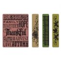
It's time again for another challenge at Our Creative Corner. Meihsia Liu is our hostess again this week and she wants us to make a Clean and Simple Kitchen project this week. So all in the interest of being a good team sport, I set out to make as close to CAS as I could get. I severely restrained myself and kept it as plain as I could bear to make it. I created my vintage Thanksgiving postcard with PhotoShop Elements and relied on dry embossing for my impact. The flower was left over from last week's round fall wall hanging and I thought it gave just enough interest to the twine bow without getting too fussy.
Okay, here's my dirty little secret...this piece sat on my desk for a day and finally I couldn't stand it any more. I broke down and pulled off the white embossed panel and stamped and glittered the orange panel. I also distressed the edges a bit. I felt much better about the card then, especially after I added the leaves and the seasonal Chit Chat stickers :)
What do you think? Which version of the card do you prefer? I thought you might like the vintage image to use on a project too so feel free to help yourself.
Thanks so much for stopping by today. I hope you have a wonderful weekend! Now it's time to hop on over to Our Creative Corner to see what the team over there came up with to inspire you to make a Clean and Simple paper craft project.






I must admit I prefer the second one, it just has that 'little something extra' that pulls the eye. A beautiful card and thank you very much for the image, I shall have a go using it! x
ReplyDeleteHi Linda, I prefer the 2nd image too. I like the sparkle and greater dimension with leaves. It has more va va voom! I love the way the twine sits in corrugated folds. Finally I have found out what CAS stands for! I had googled its meaning to no avail recently. Nicola x
ReplyDeleteBoth cards are great; but I love the second one best. CAS is not my favorite style; but I do make CAS cards sometimes. The additions you made to the card really did enhance the overall design, in my opinion! Thanks for the cute Thanksgiving image, too.
ReplyDeleteOoo gorgeous I love it. I love that postcard sooo much. Michelle x
ReplyDeleteYup... I'm for the second - but like you, I struggle with CAS!! Gorgeous sharp colours, and I love what you've done with the string and corrugated card - so clever! Thanks so much for the freebie too!
ReplyDeleteAlison x
Hahaha... Linda, you're priceless... I totally agree. I can never make a CAS card I truly like. I suppose we were just born to layer!!! LOVE your second creation, although the first is also beautiful... just not full of those heavenly extras.
ReplyDeleteHave a wonderful weekend!
Hugs!
Oh my gosh.....I love them BOTH, but I have to admit, the second one with the little leaves & words (which I just got and LOVE) is my favorite. So it may not be technically CAS but I still love it! THanks for the image, too!
ReplyDeleteI didn't mind the plain orange background but I do love the addition of the leaves and sayings!
ReplyDeleteVery cool image, thanks for sharing!
You are hilarious! I always love your projects, they always give me good ideas and are very inspiring, but I have to say CAS is not really your thing LOL! Both versions are lovely, the second one is the best. Enjoy your weekend :-)
ReplyDeleteI guess I'm going to add to the vote with #2.. love both versions, but the second has all the extras that make it my 1st choice!
ReplyDeleteI like both cards, but I love the 2nd one. It's just more "you". Lov ethe additions you made. I think it's hard to make CAS cards, especially vintage ones.
ReplyDeleteCAS is not my thing, so you know I love the latter! More pleasing to my eye! Great digi image as well.
ReplyDeleteI liked the first one....but i LOVED the second version. So much more visually appealing. I'm not a huge CAS fan. Sometimes the cards work, and sometimes they just look nekkid to me. LOL. I love the leaf cluster on the second card...and the glittered stamping is elegant. I love your work, Linda...clean and simple or funkie! LOL
ReplyDeleteSo it's official then? Thanksgiving dinner at your house??? Sweeet! Just let me know the time and I'll bring the wine. :D)
ReplyDeleteGorgeous CAS Kitchen Linda. Who would of thought to drape twine through the grooves of corrugated cardboard...OH, that's right...YOU! I love that idea!!
hugs,
Lisa xx
This is fabulous Linda!! Gorgeous design with this vintage image!! Juliexx
ReplyDeleteThey are both wonderful!!! But I do like the extra kick your additions gave to the card!!
ReplyDeleteLinda - The second card is my favorite too ;) I always love your work!
ReplyDeleteBlessings,
Michelle
Both cards are lovely. Your works are always amazing... :)
ReplyDeleteI would need to pick number two, though they are both gorgeous. CAS is hard. Sometimes I just feel I need to add more! Thanks for sharing the clip art! Best wishes, Yvonne
ReplyDelete